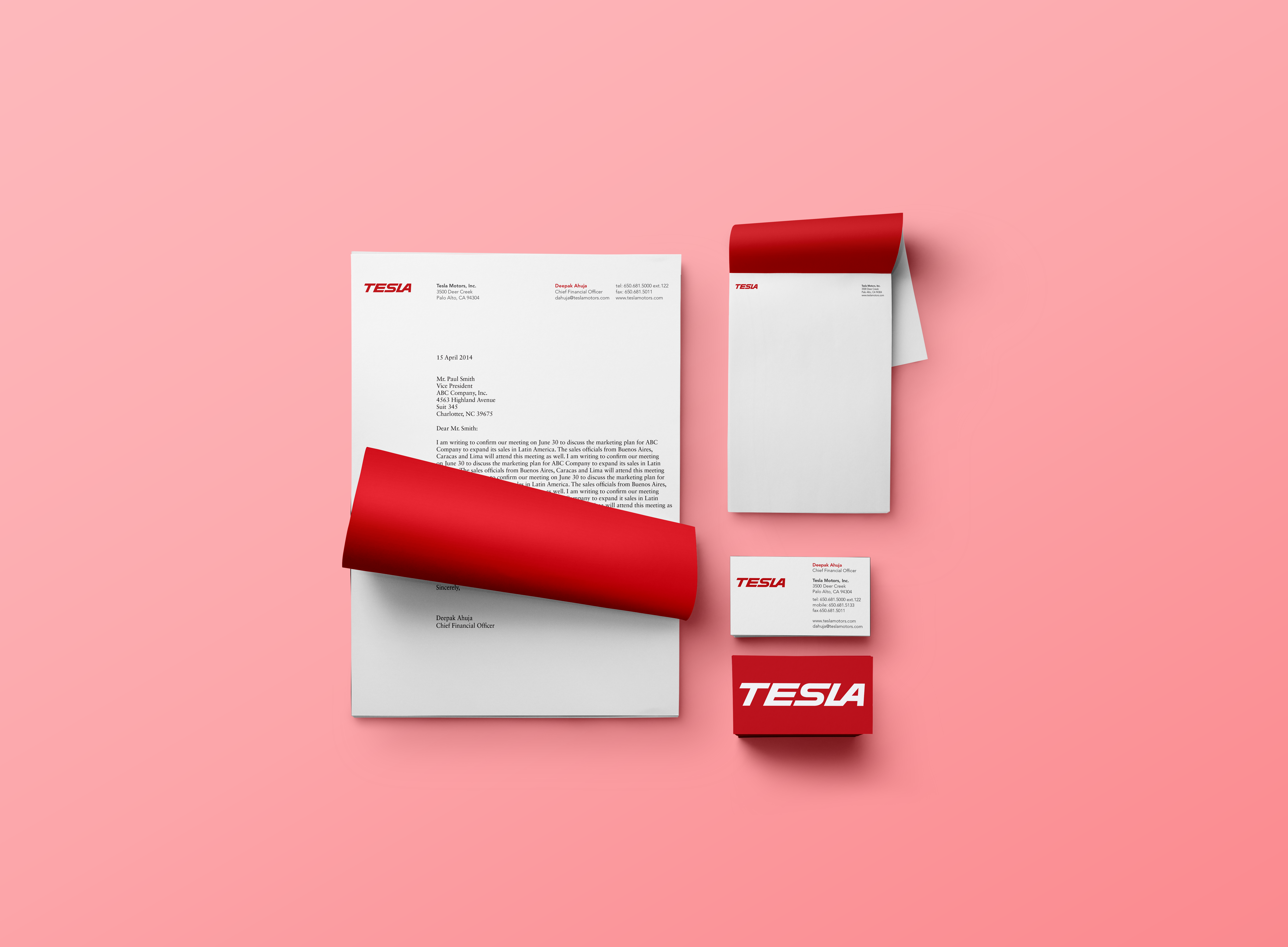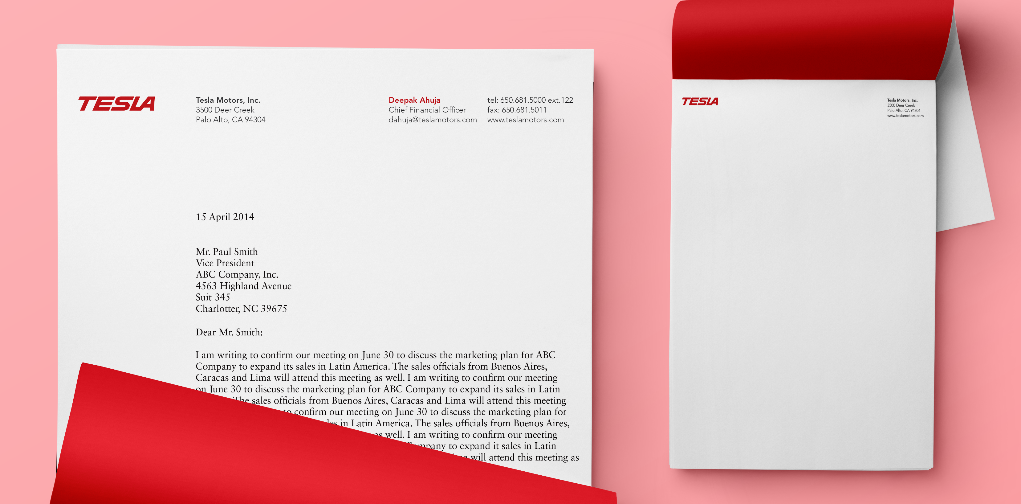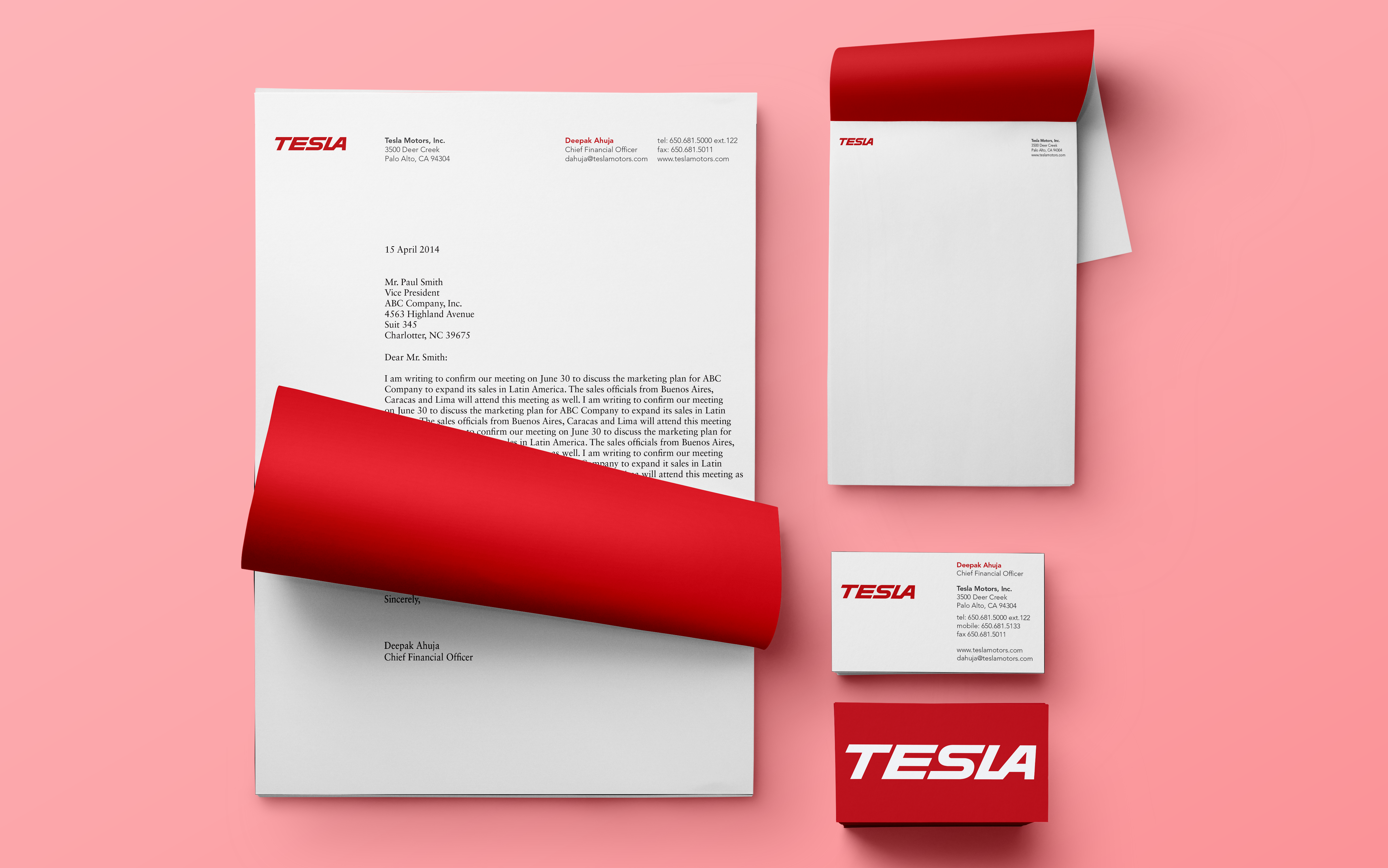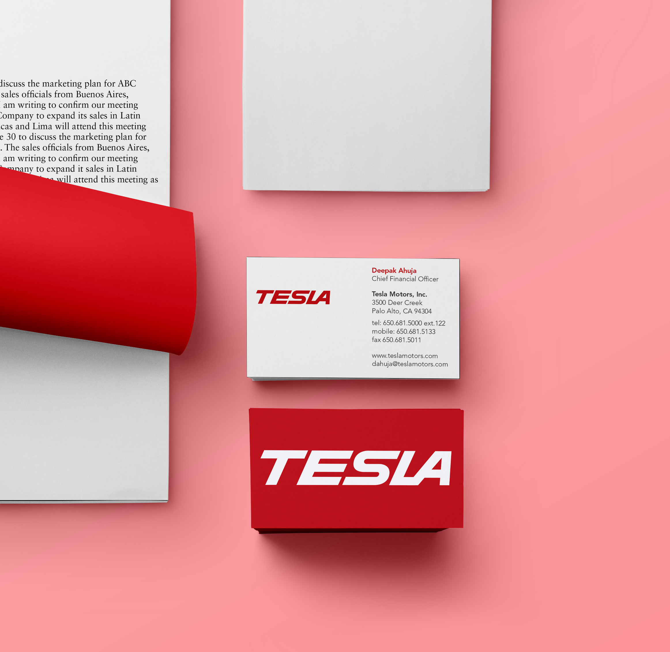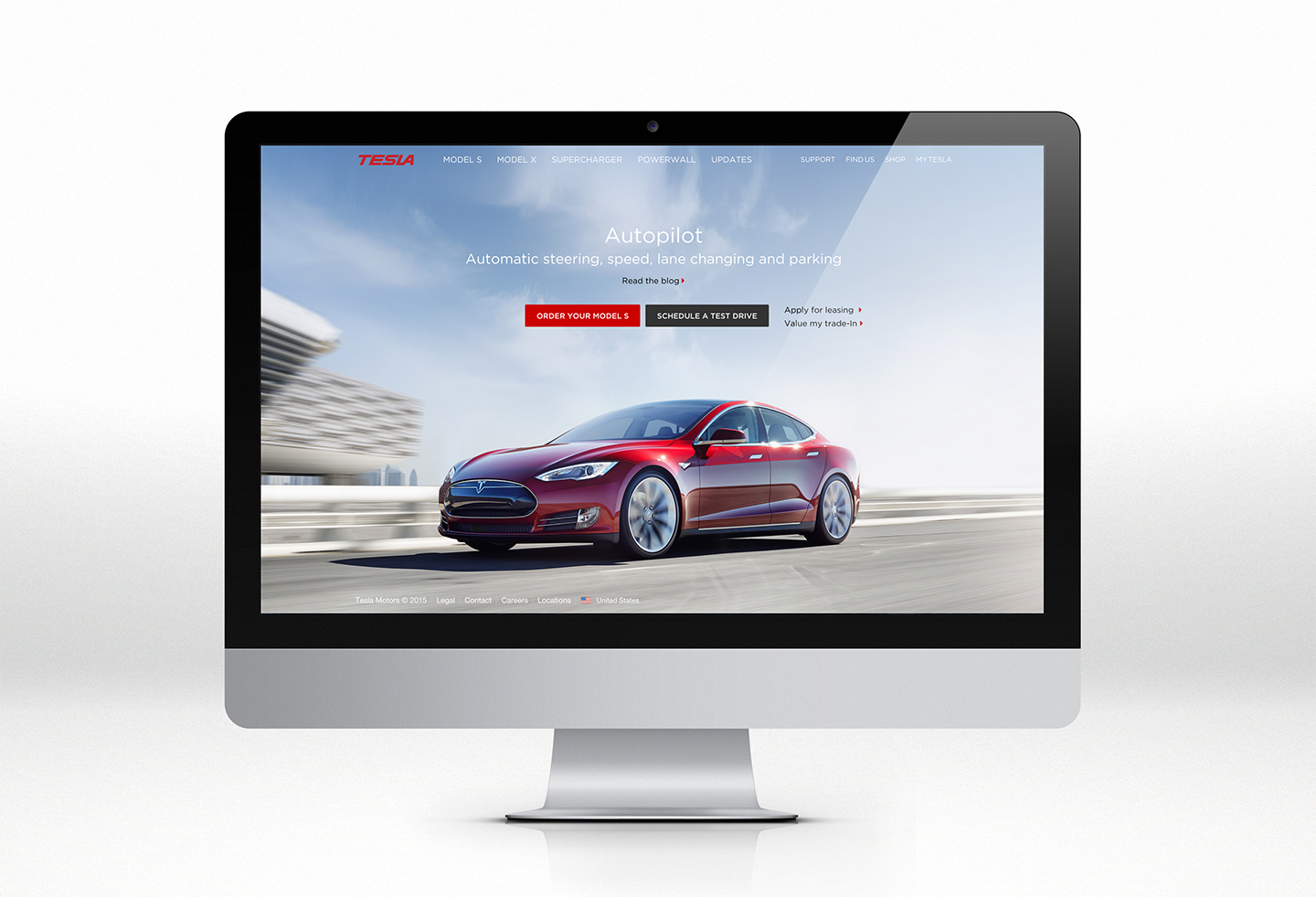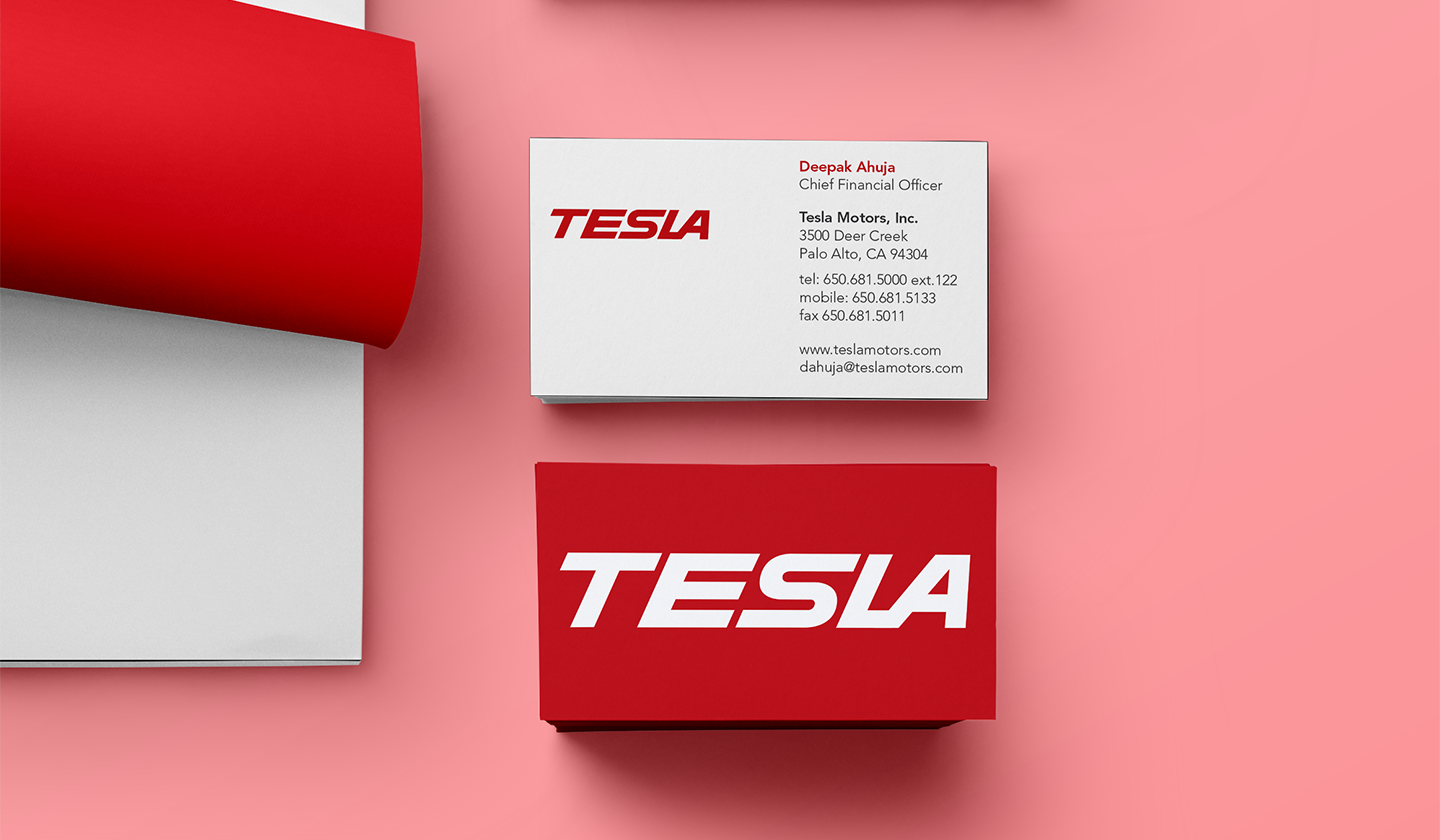
This is a redesign of the existing Tesla identity, the problem I found with the current logo is that it looks like an abstract shape and does not signify anything according to me. As a solution to this problem, the decision is to have a logotype which emphasis on speed and hi-tech nature of the product. The alphabets in the logo are hand lettered.